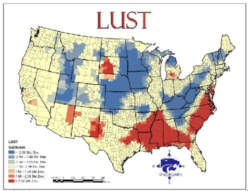
Geographers from Kansas State University have mapped the seven deadly sins using various statistical data by county. Lust, for example, was calculated using the number of reported STDs per capita (red is above average, blue below)
http://andrewsullivan.theatlantic.com/the_daily_dish/2009/05/mapping-sin.html


No comments:
Post a Comment